Blog
Welcome

Recent posts
SEARCH RESULTS FOR: Cover Design
Is this the ideal way to present your portrait photography? Your clients will love our hand made boxes, designed to keep their favourite images looking their beautiful best for years to come. They’re designed to be enjoyed too — whether for sharing with friends and family, or for quiet reflection in an overloaded world. And of course they’re a great silent salesman for you. Our Q boxes can hold up to 25 prints in 10x8 or 14x11 mats (25x20 or 45x28cm). The feature you may like best? We do the work, not you! Just upload your images and in two weeks we’ll deliver To View More >>

Everything we do is about adding value to your photography … to help sell your art, your craft, your intellectual property, your time! Matting a work of art is a powerful, longstanding way to add to its worth, and we offer matting in several products — like albums, frames and boxes. But we also offer “loose” matted prints, and new customers are sometimes surprised to find they’re just as beautifully presented. We supply them with an embossed cover sheet to protect the mat and print … and make the treasure inside more special. The embossed Q device To View More >>

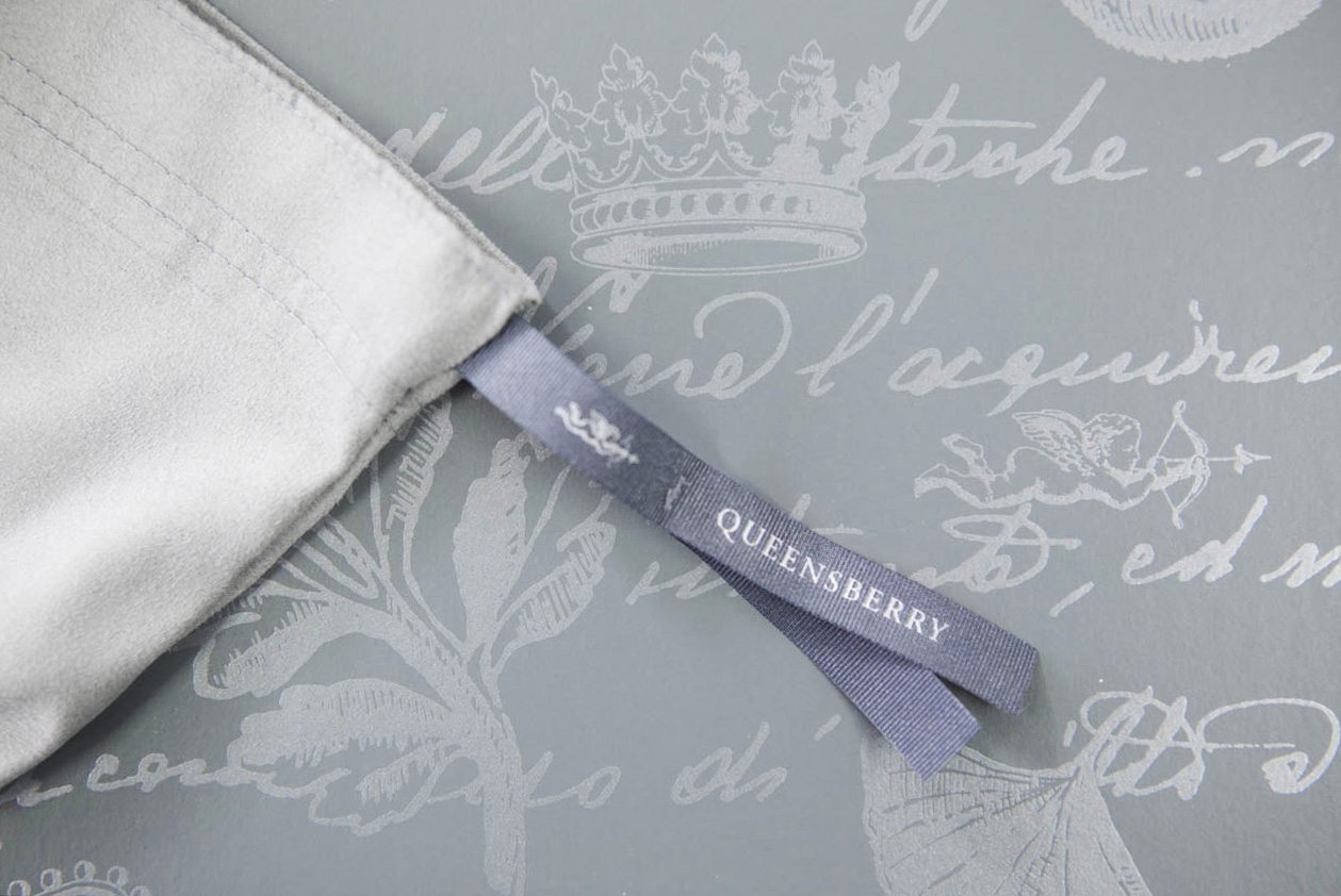
The presentation box our albums come in has a long history. Developed for us in 1995 by leading designer Donna Hoyle, it combines two graphic elements: a 17th Century Italian text, and a series of leaf and heraldic devices including our own Cherub. It doesn’t even bear our name, but to us, and our customers, it’s a key part of our identity, like Tiffany’s Blue Box… but maybe not as famous! The Box even survived a total rebranding in 2008, when we couldn’t bear to part with it. It was another seven years before we refreshed the design, and even To View More >>

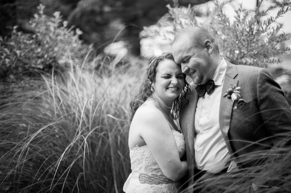
Spring Smith lives in the mountains of Maine in north east New England, USA, and her location impacts both her photography and the events she covers. “We don’t have many ballrooms, so most of my images are taken outside, and when we are inside typically it’s a large barn or a tent.” She thinks living in a rural area makes for a slightly more relaxed atmosphere. Weddings aren’t the high end, over-the-top luxury type. “We are surrounded by the creatives, nature lovers, the couples who want to be outside or want to bring the outside in.” To View More >>

A personal website for your clients, with your photography, your client's album design, a gift registry, a guest book, a link to your own site… oh, and a shopping cart! In just a few minutes you can create a beautiful-looking site that your clients will find appealing and useful, that provides a convenient way to interact with them about their album, and that helps spread the word about you, while encouraging some nice add-on sales from friends and family. Workspace has three new and improved designs that reflect our web themes, are mobile responsive, and are just as easy To View More >>


Email: info@queensberry.com
Free Phone Numbers:
New Zealand: 0800 905 905
Australia: 1800 146 251
USA: +18668350851
UK: 0800 808 5271
Canada: +1 855 581 0370