Blog
Welcome

Recent posts
SEARCH RESULTS FOR: Time
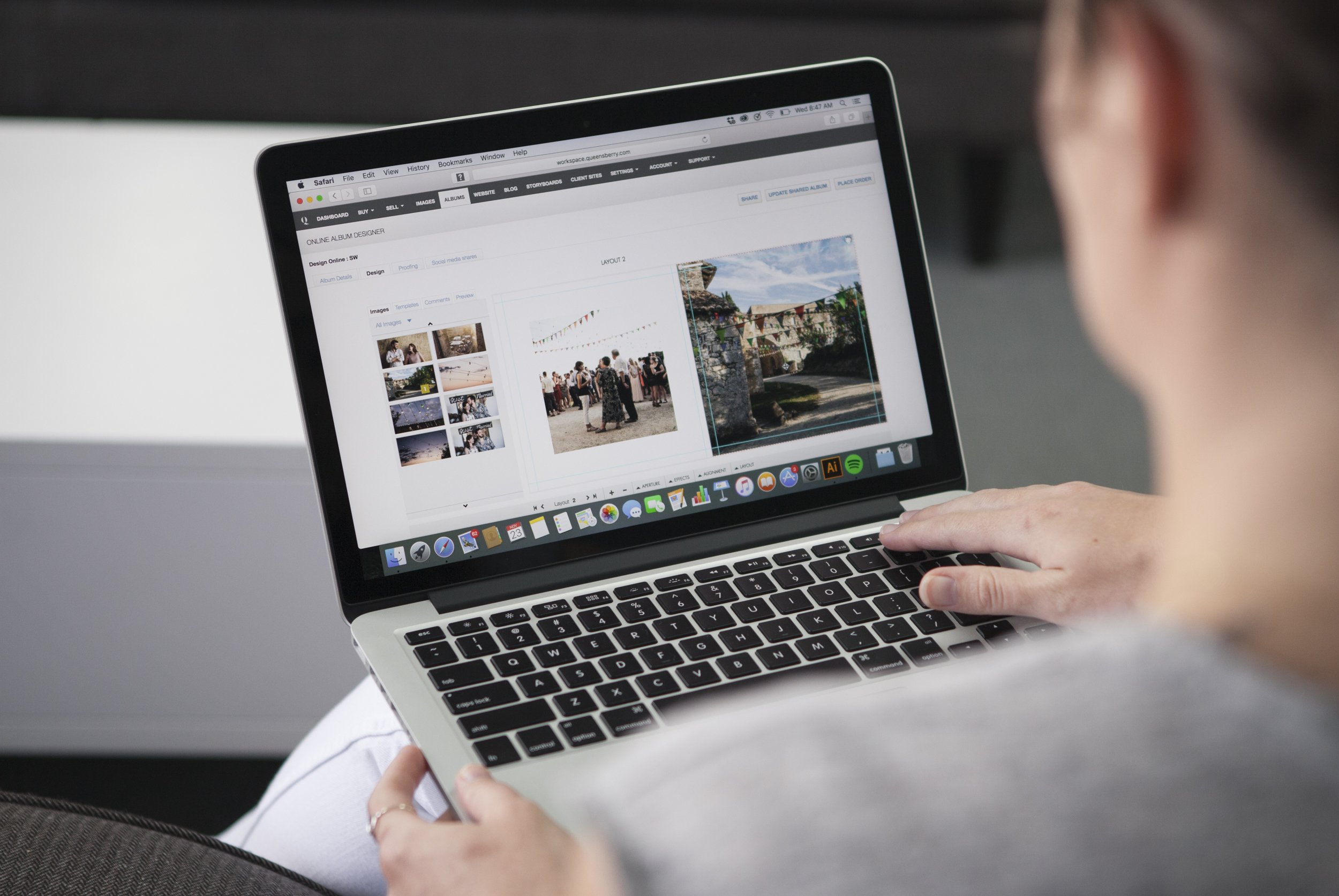
Following on from last week's post, here are a few more album design tips. For all you photographers designing your own. Let them breathe… We touched on cropping last time, but it's worth repeating! Sure photo-bombing is fun, but generally we like the core elements of an image to have a nice amount of breathing space to the edge of the page, or image "frame". In fact think of it exactly like framing a picture: it gives the subject a sense of intent and importance. Jamming things up against the image edge often looks awkward. To View More >>
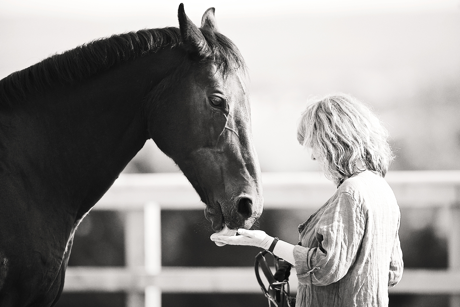
Lorraine contacted Nick saying that she wanted a photoshoot of her sister Janine, and to give her an album for Christmas. Nick talks about the shoot, and how he approaches photographing dogs and horses. One of Janine's horses, Kenya, had been with the family for a number of years, and Lorraine thought it would be nice to capture them together, whilst Kenya was still a fit and active horse. Of course, the other family animals, Brody the highland pony, and Jack and Louie, their two dogs, would also star in the shoot. The main difference To View More >>
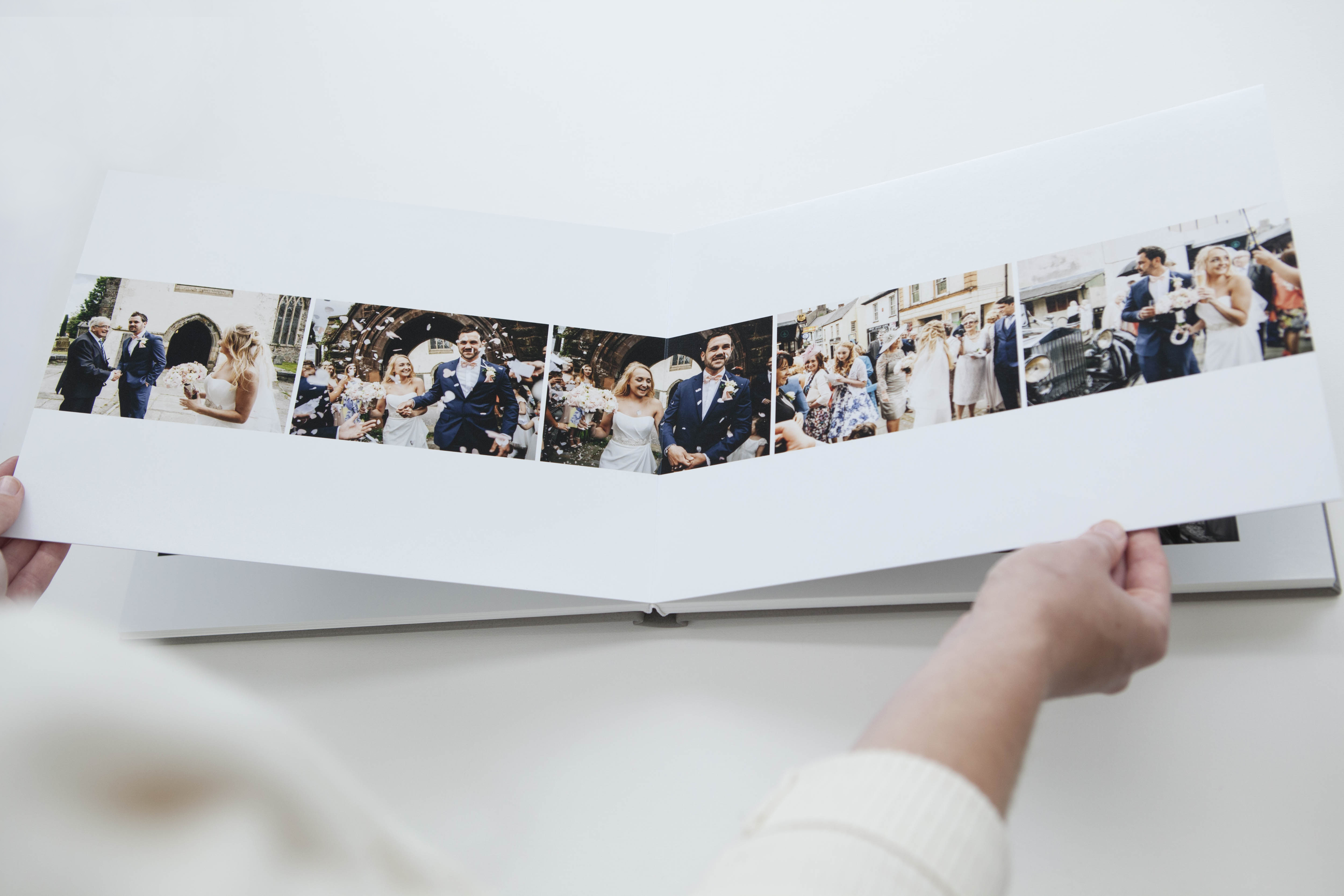
Panorama flushmounts are our fastest growing album category. Many photographers love the fact that the prints are creased, not cut, at the spine, that we offer both Fine Art (inkjet) and traditional photographic printing, and that our optional medium-weight pages mean you'll have a sleeker looking album, and can include more layouts. So here’s the thing: Is this the first you've heard about our Panos? Or maybe you never got round to ordering a sample? Now's the time! Get 50% off with our special offer. Order a Panorama Sample Album now, ready for January delivery, To View More >>
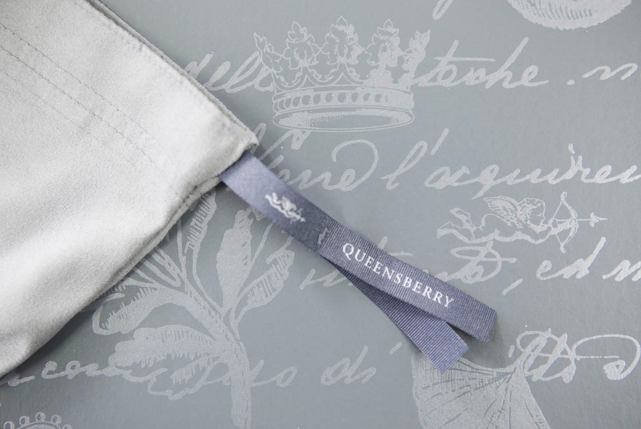
The presentation box our albums come in has a long history. Developed for us in 1995 by leading designer Donna Hoyle, it combines two graphic elements: a 17th Century Italian text, and a series of leaf and heraldic devices including our own Cherub. It doesn’t even bear our name, but to us, and our customers, it’s a key part of our identity, like Tiffany’s Blue Box… but maybe not as famous! The Box even survived a total rebranding in 2008, when we couldn’t bear to part with it. It was another seven years before we refreshed the design, and even To View More >>
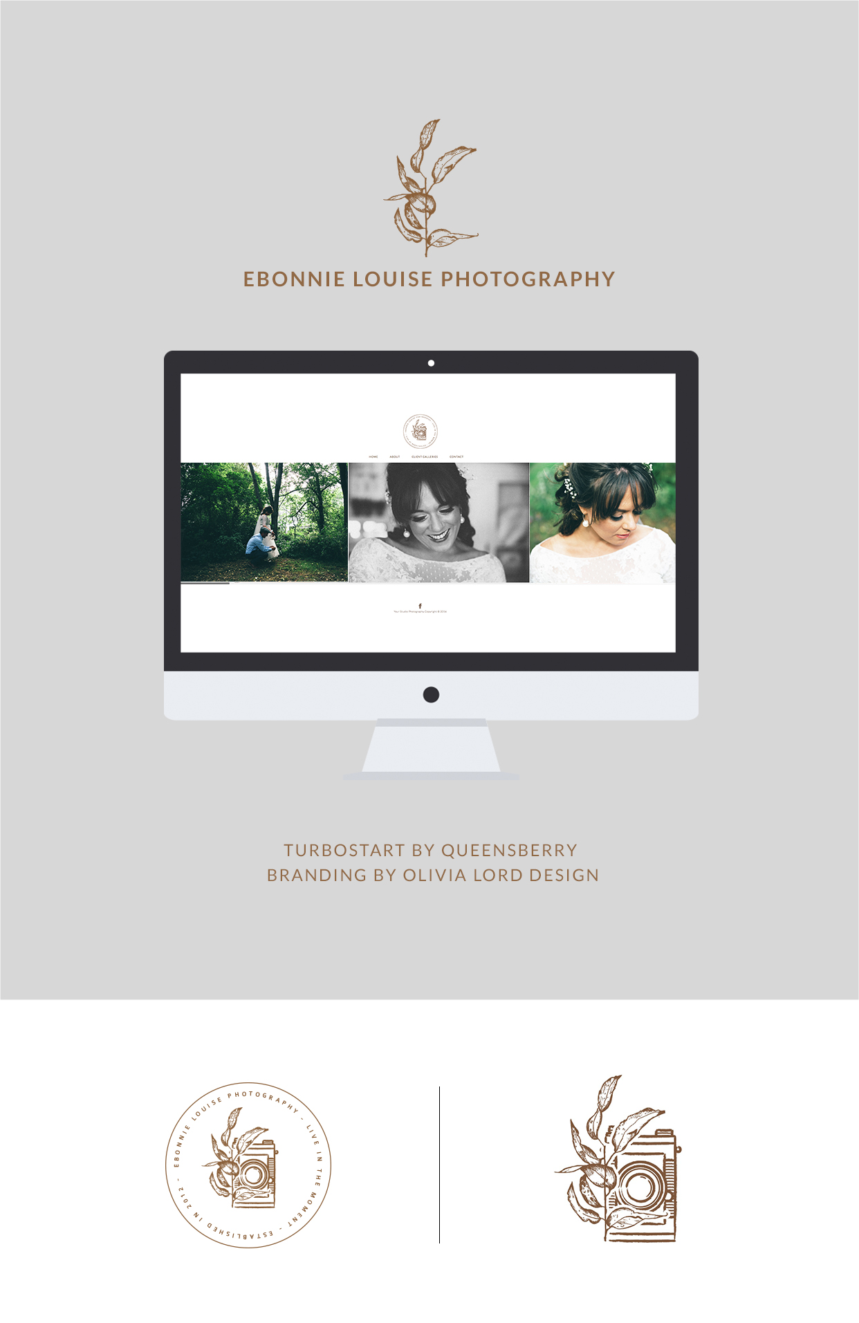
Recently we worked with Ebonnie Louise Photography to set up her website, and we had so much fun we thought we’d share it with you. We worked with her under our Turbostart service, which helps photographers with their Workspace websites. Ebonnie had worked with Olivia Lord Design to create her brand identity, so she came to us with a strong brand, and brand message, which was great, for two reasons. First, we knew exactly what she was after, which made her the ideal customer. And second, Turbostart is not about design and branding, but the technical To View More >>


Email: info@queensberry.com
Free Phone Numbers:
New Zealand: 0800 905 905
Australia: 1800 146 251
USA: +18668350851
UK: 0800 808 5271
Canada: +1 855 581 0370