Blog
Welcome

Recent posts
SEARCH RESULTS FOR: albums

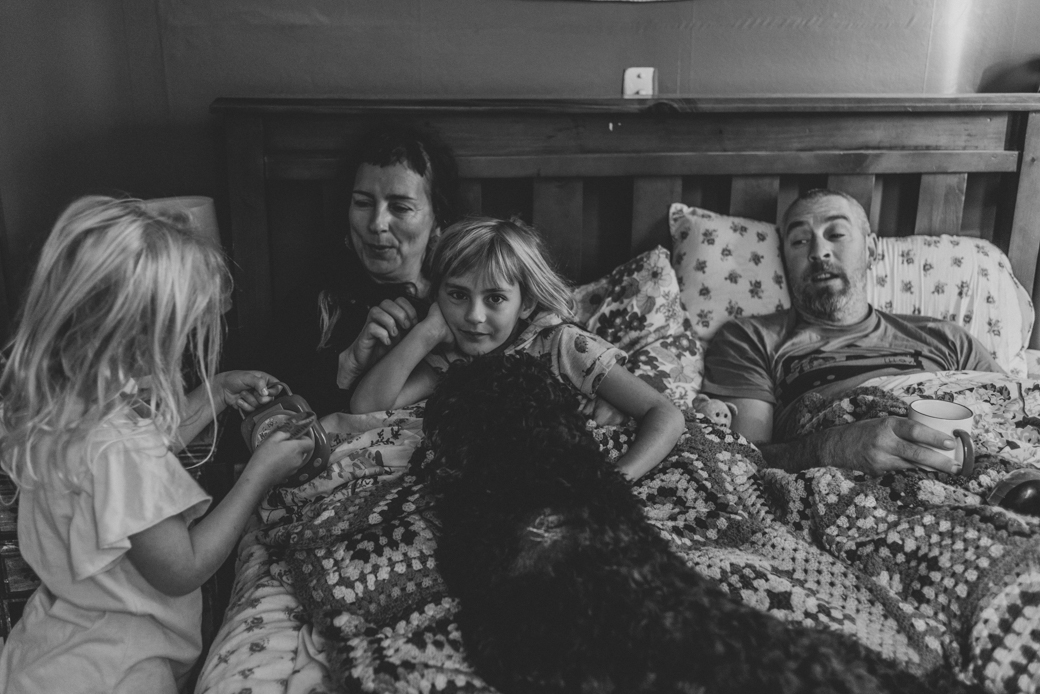
Towards the end of last winter, photographer Rachael Brown hired a small camper, and set off on an adventure around the North Island of New Zealand. Her goal: to photograph families in their homes for her series This is Home, inspired by the photos that Rachael's Dad took when she was growing up. Rachael has spent many hours flicking through those photographs. They evoke in her a strong sense of nostalgia, and she hopes her own images will have the same effect on the families she photographs. Four years ago Rachael had a complete shift in how she captured family connection. To View More >>

Talk about wedding envy! The Queensberry team are practically swooning over Helen and Michael's gorgeous album by Ellie Gillard. Every detail of the day is highlighted beautifully, and given the attention it deserves. Helen & Mikey (as he’s known to Helen) got married at Trinity Buoy Wharf in the Docklands. It's one of Ellie's favourite venues in London, both urban and epic. Treated to one of the first hot days of 2016, the wedding party, and Ellie, cruised down the Thames to the reception, drinking prosecco on an ever-so-slightly 70s party boat, before To View More >>

Following on from last week's post, here are a few more album design tips. For all you photographers designing your own. Let them breathe… We touched on cropping last time, but it's worth repeating! Sure photo-bombing is fun, but generally we like the core elements of an image to have a nice amount of breathing space to the edge of the page, or image "frame". In fact think of it exactly like framing a picture: it gives the subject a sense of intent and importance. Jamming things up against the image edge often looks awkward. To View More >>

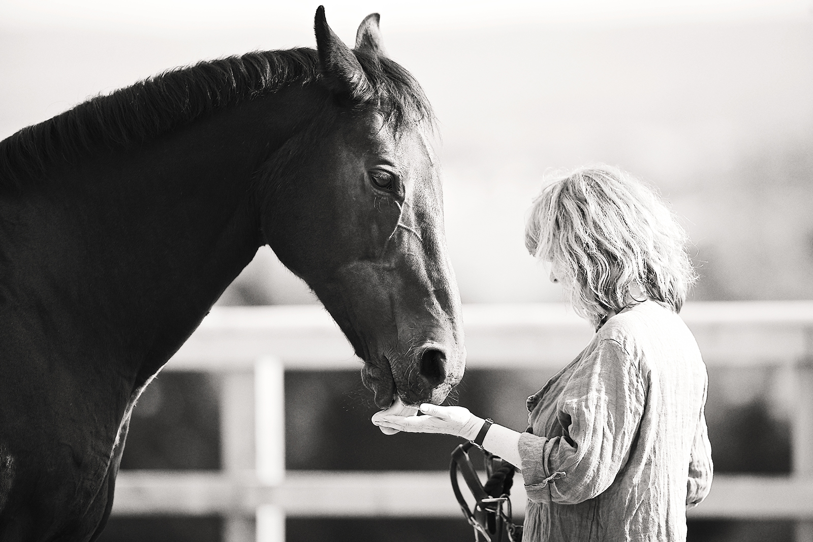
Lorraine contacted Nick saying that she wanted a photoshoot of her sister Janine, and to give her an album for Christmas. Nick talks about the shoot, and how he approaches photographing dogs and horses. One of Janine's horses, Kenya, had been with the family for a number of years, and Lorraine thought it would be nice to capture them together, whilst Kenya was still a fit and active horse. Of course, the other family animals, Brody the highland pony, and Jack and Louie, their two dogs, would also star in the shoot. The main difference To View More >>

We caught up with two of the design team, Simon and Rachel, to talk all things album design. Here are their top four tips for creating beautiful, clean layouts. Less is more Rachel: Unclutter your design. It’s simple. Let the key images and high quality materials of an album speak for themselves. If you notice the design, it’s taking precedence over the images – good design is effortless. Simon: If the design is loaded with images the hero shots can be lost among a forest of images. By keeping the image selection minimal, you’ll free up space and make To View More >>


Email: info@queensberry.com
Free Phone Numbers:
New Zealand: 0800 905 905
Australia: 1800 146 251
USA: +18668350851
UK: 0800 808 5271
Canada: +1 855 581 0370