Blog
Welcome

Recent posts
SEARCH RESULTS FOR: books

Isn't technology great? A decade ago "photo books" were a wonder. I can create one-off books! Printed on both sides! Like a glossy magazine! We loved them too, and launched Q Books in 2010. But now photo books are … just a glossy magazine! Commodity products with prices to match. Mostly sold direct to consumers, meaning very little value in them for photographers… Something for people who get their photography on a flashdrive. Q Books still look great, as beautifully printed and bound as our albums, but for a couple of years the trend has been To View More >>

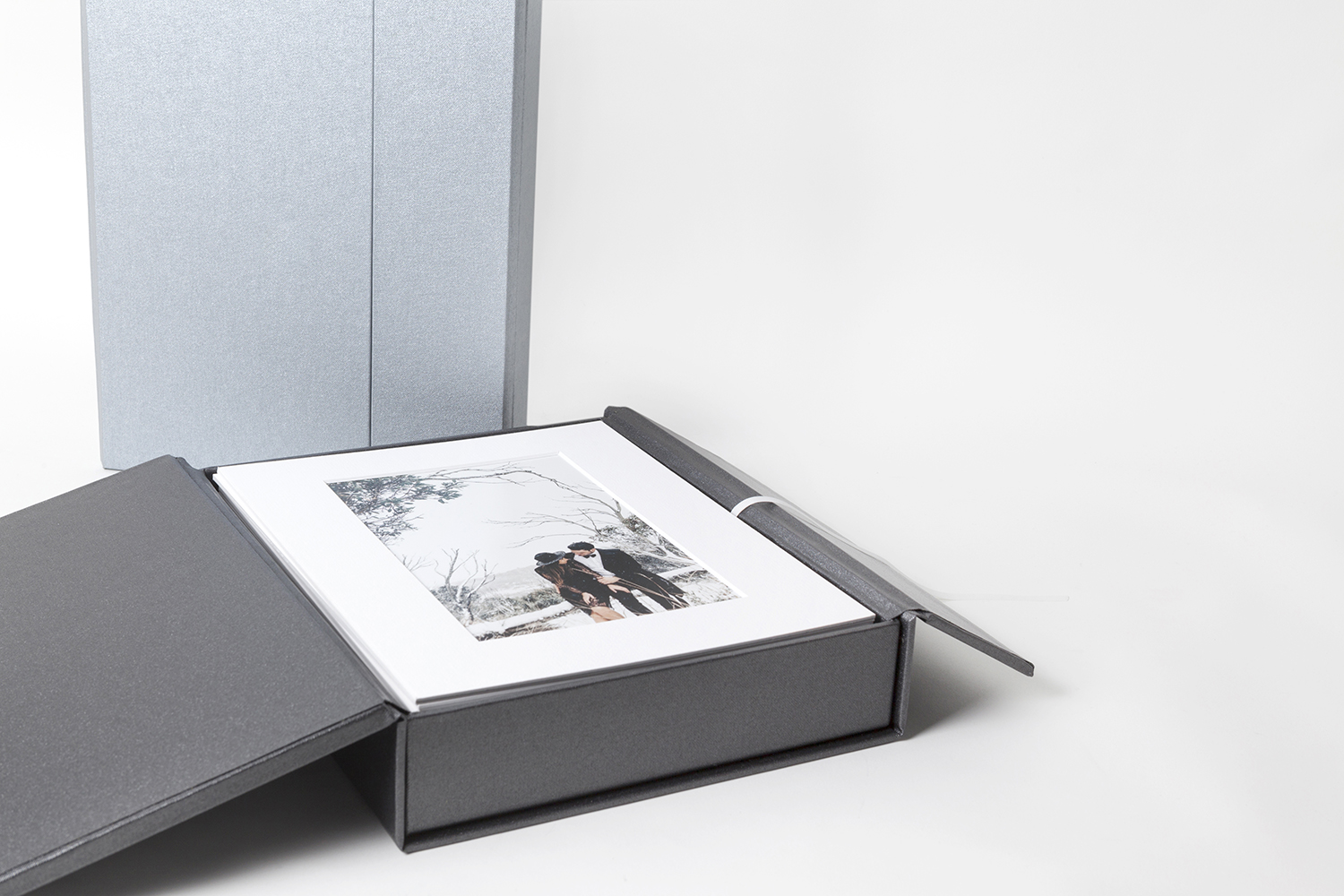
Premium Boxes, Studio Boxes, Print Boxes — what are the differences?Premium Boxes (for matted prints) Premium Boxes are available in two sizes, 10x8 and 14x11. They're made with a beautiful split-lid design, fastened with a hidden magnetic catch. They have a narrow white ribbed ribbon to help in lifting out the matted prints. They accept up to 25 mats, or 20 if you request the optional USB flashdrive insert (flashdrive not included). We supply premium Boxes printed and fully assembled, ready for your clients, To View More >>

To that old saying about the only certainties being death and taxes, we need to add CHANGE! Change never ends, and as long as you don’t mind a bit of a roller coaster, it’s way more fun! We have so much coming up over the next weeks and months, we thought we’d better give you a heads-up. If you like what we stand for, we think you’ll love what we’re doing. And what do we stand for? Beautiful photography, beautifully presented. But it’s your opinion that matters, so click through to comment on our blog or Facebook. We’d love to To View More >>

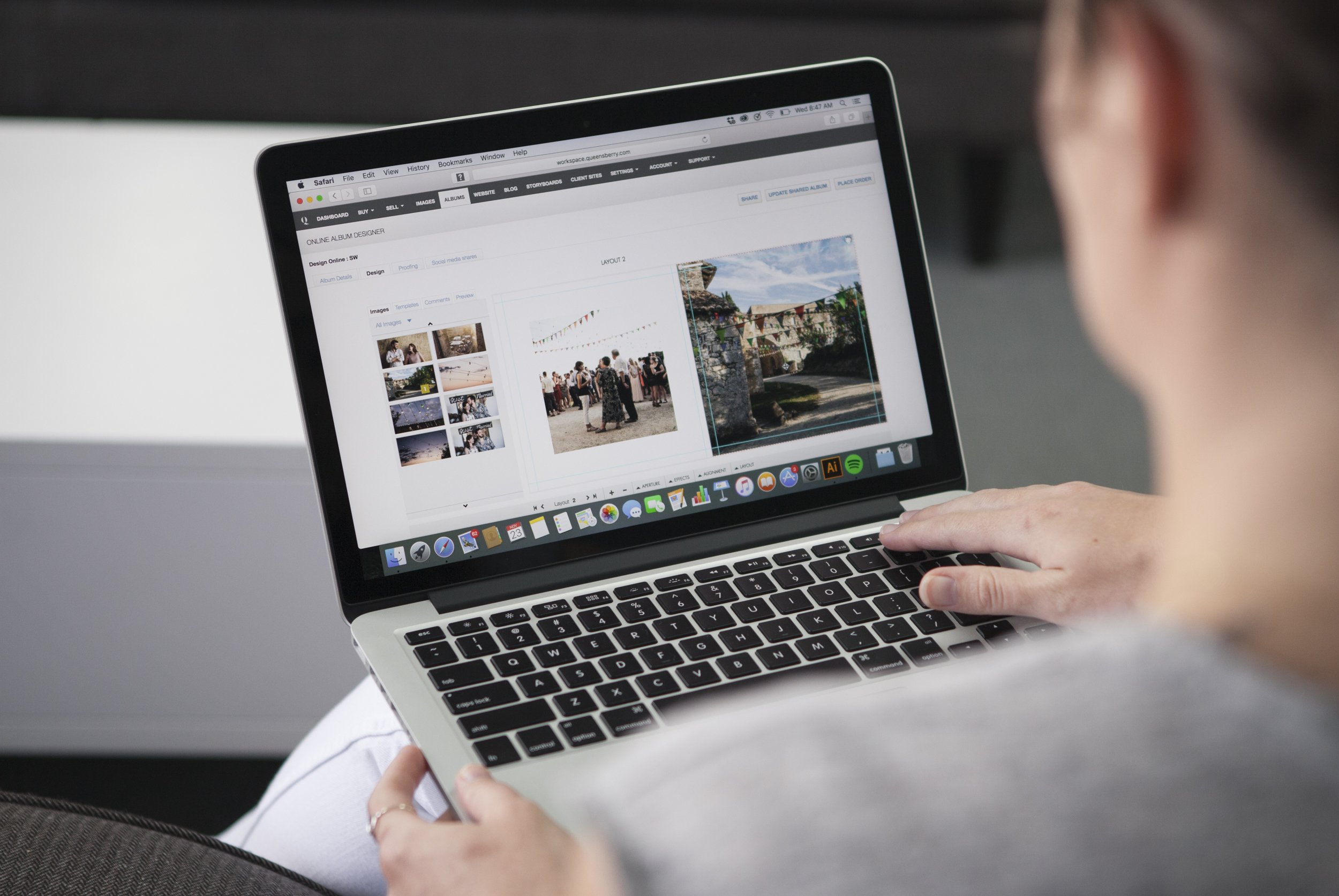
Following on from last week's post, here are a few more album design tips. For all you photographers designing your own. Let them breathe… We touched on cropping last time, but it's worth repeating! Sure photo-bombing is fun, but generally we like the core elements of an image to have a nice amount of breathing space to the edge of the page, or image "frame". In fact think of it exactly like framing a picture: it gives the subject a sense of intent and importance. Jamming things up against the image edge often looks awkward. To View More >>

We caught up with two of the design team, Simon and Rachel, to talk all things album design. Here are their top four tips for creating beautiful, clean layouts. Less is more Rachel: Unclutter your design. It’s simple. Let the key images and high quality materials of an album speak for themselves. If you notice the design, it’s taking precedence over the images – good design is effortless. Simon: If the design is loaded with images the hero shots can be lost among a forest of images. By keeping the image selection minimal, you’ll free up space and make To View More >>


Email: info@queensberry.com
Free Phone Numbers:
New Zealand: 0800 905 905
Australia: 1800 146 251
USA: +18668350851
UK: 0800 808 5271
Canada: +1 855 581 0370